Data Visualization – Don’t Make Me Think
Understanding big data can demand big mental effort, and good presentation should minimize that effort. So, allow me to co-opt the name and concept of a great UI book, Don’t Make Me Think, and apply the concept to data presentation rather than user interface design.
The table below shows four events taking place between a store and a warehouse. The events are named here simply for their colors and all occur within an hour and a half. If you were to look at this data and try to understand what took place you would be trying to construct a mental model of the sequence of events and how they are related to each other. Once you construct that model you would look at it to find anything that is unexpected or undesirable.
| Color | Depart | Time | Arrive | Time | Duration |
| Green | Store | 12:00 | Warehouse | 12:32 | :32 |
| Blue | Store | 12:00 | Warehouse | 12:30 | :30 |
| Red | Store | 12:00 | Warehouse | 13:17 | 1:17 |
| Green | Warehouse | 12:34 | Store | 13:03 | :29 |
This data set contains some key observations that are waiting to be discovered by the user:
- Three colors left the store at the same time
- Two colors arrived at the warehouse at almost the same time, but not exactly the same time
- One and only one of those then returned back to the store as soon as it arrived at the warehouse
- One of the colors took much longer to arrive at the warehouse
- The color that took longer to get to the warehouse took longer than the one color to make a full round trip
A data analyst, or a moderate power user, could produce a chart like the one below to discover the observations:
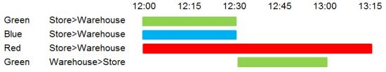
If you are comfortable with data and charts you probably had no problem with that. However, for casual users this can require some mental effort to first understand how to read and digest the chart. An important shortcoming of this chart is that it gives no visual representation of the direction of the event, it has to rely on text, e.g. “Store>Warehouse”.
It is, however, a simple matter for anyone to look at an animation of the events and immediately understand what happened, without having to think.
The above is a very simple example, and can lend itself to a static chart, but adding more data, and more types of events, quickly transcends the ability of static charts to reveal key observations. I’m not going to event attempt a static chart of the following.
An animated visualization itself may be too complex to grasp, but it can be relied on to point to times and events of interest.
Once areas of interest are spotted, a tool like Vuzop enables the user to easily manipulated time to explore what actually happened in the past, or is happening in realtime.
Key time control features that help understand events include:
- playback speed
- playing backwards
- looping
- looping with reverse bounce
- comparing to other periods of time
It is important to understand that this sort of animation does not replace common data analytics visualization tools, but rather is a supplement to them, allowing users to quickly access visual models that fit how they think, and from there, find problems and opportunities that could use close view data analysis.
Comments
No comment yet.